Showing posts with label obscure. Show all posts

Wednesday, 8 July 2009

Obscure Kits From British Football History #10

Sheffield Wednesday (home)
1965 - 1972

As a football fan of some advanced years there comes a point in your life when you find yourself pondering some of the quirkier aspects of the game's history. Things like 'When was the last time Ron Atkinson was a colour other than orange?' or 'Was Bryan Robson born injured?'

One such question that recently crossed my mind (and frankly didn't have far to travel) was "Why are Arsenal the only team to wear a shirt that has white sleeves contrasting another main colour?" It did, honestly.

The answer I arrived at was a simple one. Arsenal's white sleeve motif is not unique in the history of world football. North of the border, Hibernian have worn green shirts with white sleeves for many years while other teams such as Middlesbrough and Manchester City have had brief dalliances with the same white-sleeved approach in the not-so-distant past.

One team, however, abandoned the longest traditions of their football kit history for seven long years back in the mid-60's as they opted for white sleeves on a blue shirt. They were Sheffield Wednesday.

If ever a club remained unflinchingly attached to the uniform they wore, it was this one. For as long as anyone can remember, Sheffield Wednesday have always entered the field of play wearing blue and white striped shirts - even going back to the late-19th century when they were simply known as 'The Wednesday'.

So many players have been seen wearing those stripes over the years: Tommy Craig, Terry Curran, Carlton Palmer (OK, perhaps not Carlton Palmer...) The team's on-field identity remained strong and resolute throughout, yet between 1965 and 1972 it was all thrown away in favour of the strip you see here.

And make no mistake - this wasn't a 'here today, gone tomorrow' affair either. This was a genuine attempt at injecting some life into a famous old club at a time when they were on something of a high.

Having established a foothold in the old Division 1 in the late-1950's, The Owls pushed on and reached the FA Cup Final in 1966, although sadly this kit wasn't seen at Wembley thanks to Everton having first choice of shirt colours. No matter - Wednesday's kit was seen by a great many people before it disappeared without trace in 1972, never to be seen again.

From that point onwards it was back to the tried and trusted blue and white stripes, but distinctive though they are, who here would like to see the white sleeves return? I would, but then that's because I have a mind that ponders on quirky stuff like Ron Atkinson's skin colour and Bryan Robson's medical record.

Sunday, 25 January 2009

Obscure Kits From British Football History #9

Chelsea (away)
1978 - 1981

You'll have gathered by now that SPAOTP are big fans of ITV4's brilliant retrospective of vintage football, The Big Match Revisited. The series showing hour-long re-runs of football action from the 1978/79 season is a joy to behold for anyone that yearns for a more innocent time before rampant commercialisation took over.

This week's show featured a First Division clash between Manchester City and Chelsea at Maine Road dated January 22nd 1979, and it's from here that we get the latest in our Obscure Kit series.

With Manchester City playing in all-Sky Blue, Chelsea (managed by Danny Blanchflower) couldn't possibly enter the field of play wearing their traditional Royal Blue shirts for fear of a colour clash. It was therefore time to wheel out the change strip, and even by the rich and varied history of all Chelsea'a change strips, this one was a bit peculiar.

When playing away from home, Chelsea have worn various colour combinations down the years - white and blue, red and white, even yellow and blue, but between 1978 and 1981, Chelsea opted for the rarely seen combo of yellow and green.

A quick check of my True Colours book by John Devlin tells me that ostensibly this was an all-yellow kit with green trim, but on certain isolated occasions (such as the aforementioned match against Man City) green shorts would be worn to create a distinctly 'Norwichesque' ensemble.

Chelsea's kit at the time was made by Umbro and featured their familiar styling du jour, namely the famous diamond logo running liberally along the sleeves, shorts and stocking tops. It was a device they used to great effect on their blue and white home kit back then, but when their yellow away kit was originally launched in 1977/78, it featured blue trim, not green.

Obviously someone in the Marketing department decided to change things around to give the team a more Brazilian feel for the following year, but it didn't do them much good - they were relegated at the end of the 78/79 season and promptly stayed in Division Two for five long seasons.

Oh well, at least they'd make up for that with interest a decade or two later. And as for that yellow and green kit, we've still got the photographic evidence to remind us of a time when Micky Droy et al looked ever so slightly Brazilian. Or like a member of Norwich City's reserve team - one or the other.

Wednesday, 1 October 2008

Obscure Kits From British Football History #8

Tottenham Hotspur (away)
1977 - 1980

As the title suggests, this occasional series plucks the most obscure football kit designs from the history of the sport and puts them under the microscope for all to see (and indeed laugh at).

One trend we've noticed since we started this series is that many of these long-forgotten obscurities were originally made by Admiral. This seemingly harmless company based in Leicester were responsible for some of the most peculiar and outlandish designs seen throughout the 1970's and 80's, and today's offering is no different.

For part 8 of our 'Obscure British Kits' series, we give you the Tottenham away strip from 1977 to 1980.

What's the first thing you notice about it? Come to think about it, what's the only thing you'll notice about it? That's right - it's that strange over-the-shoulder thing going on either side of the big flappy collar.

Be honest, have you ever seen a feature like that on a football kit before or since? We'll take it as read that your answer was 'No'.

What would be an otherwise perfectly harmless pale yellow and navy blue strip is somewhat overshadowed by that odd band hanging over the shoulders.

It's neither a stripe or a panel - it's just a thing. Did Admiral apply it to anyone else's kit, we wonder? If you know, please get in touch with us in the usual fashion.

Meantime, all we can do is stand back and admire it (if indeed 'admire' is the word we're looking for) and to rack our brains as to where we've seen something similar in the past.

Wait a minute - perhaps this is the answer...


(Our thanks go to John Devlin at True Colours Football Kits for giving us kind permission to use the above kit design image.)

Saturday, 12 April 2008

Obscure Kits From British Football History #6

Sunderland (home)
1981-1983


We've talked before about how some teams are synonymous with a particular look to the kit they wear. Many teams prefer a bold strip of just one colour (think Real Madrid and Liverpool), others like to wear hoops (a la Queens Park Rangers and Sporting Lisbon) while a distinct minority have adopted an interesting half-an-half appearance (such as Feyenoord and Blackburn Rovers).

For many though, it always was and always will be stripes for their club's kit. One such team that falls into that category is Sunderland, and as you'll all be aware, they consider their red and white stripes to be the perfect antidote to the black and white of their near neighbours Newcastle United.

Those big red and white bands running the full length of the Sunderland shirt have almost always been accompanied by black shorts, except for a spell between 1961 and 1973 when they were white. The stripes seemed a non-negotiable facet to the club's identity, but when Sunderland returned to the old First Division in 1980 after a three-season lay-off, a change to the kit was not far off.

Someone somewhere decided that as this was the start of a new era in the top flight for The Rokerites, the kit should reflect the new beginning that was underway. For the 1980-81 season, Sunderland were to wear a home strip featuring no bold red and white stripes, no black shorts - not even white shorts. This was something utterly different than anything they'd worn before.

The new kit was made by Le Coq Sportif who, back then, were a major manufacturer of football attire for people like Aston Villa, Tottenham Hotspur and even the Argentinean national team. They took on the Sunderland brief and gave them a design which, like all individual and revolutionary designs, would go down in history as either an unsurpassable classic or a never-to-be-repeated aberration.

The new shirt was predominantly white but featured a series of double tramlines in red running from top to bottom. These weren't stripes in the old-fashioned sense, nor were they the pinstripes that were so prevalent in the game around this time. These were 'thin stripes' and they were about as popular as they were visible from not-too-far away.

Even the shorts were red - another dramatic break from tradition - but then that's probably the only colour they could have been as white or black might have looked a bit silly. Finish off the job with a pair of red socks and there you have it - a kit that lasted for two seasons and has never been matched before or since.

It didn't go down well and the design was scrapped in 1983, as were the manufacturers. When Nike arrived as a new name on the British sportswear scene, they did the decent thing and wasted no time in reinstating the thick red and white stripes again. The old kit didn't even have the kudos of being worn by anyone famous (apart from Ally McCoist, pictured) such was the very ordinary team they had back then.

We can therefore say this was just an interesting experiment that's best left in the scrapbook of British Football Kit Design for another twenty-five years until someone else stumbles upon it. Sometimes you just don't win anything for trying to be revolutionary. Tradition is what people like, and more often than not as a football kit designer, you're best of just staying with the tried and trusted. It's just a shame no-one at Le Coq Sportif knew that.

Sunday, 3 February 2008

Obscure Kits From British Football History #5

Crystal Palace (home)1971/1972 season

When it comes to football kits, there are only so many different designs you can create which are simple, distinguished and can last the test of time. Whoever it was that decided black and white stripes were a winning combination must still be receiving royalties from Juventus, Newcastle United, Botafogo and many other clubs to this day.

Similarly, that pairing up of green and white hoops must have put a very large tick in the box for the people running Celtic and Sporting Lisbon when they were trying to work out what their team should wear.

As for Ajax, they must be have one of the most exclusive niches of all, thanks to that very individualistic broad red stripe running down the middle of their clean white shirts.

We can only guess it was this last example that prompted the chairman of Crystal Palace to go for something similar in the early 1970's when he opted to change the team's strip, but a big red stripe was too obvious. What they needed was something that nodded noticeably in that direction yet had a degree of distinction that would make the design all their own.

And so it was that in the 1971/72 season, Crystal Palace FC unleashed the following kit onto an unsuspecting world:


Yes, witness one and all the Double Stripe of Crystal Palace, replete in claret and blue.

Now at this point, the younger folk amongst you may be starting to make comparisons with the kit Crystal Palace wore on and off from 1976 onwards - you know, the one with the red and blue diagonal sash on a white background.

The thing to note here, though, is that while these days we're all used to seeing Palace wearing red and blue the whole time, back then their kit sported decidedly Burnleyesque hues.

So this was something of a radical departure from either claret and blue shirts or plain white ones as had been worn before it. This was a bold move and one which perhaps epitomised a brave new identity for the team and one which would would spark a change of fortunes for Crystal Palace.

It was. Call it coincidence if you will, but the introduction of the double-stripe initiated a gradual decline for the club which would see them drop from the First Division to the Third in the space of three seasons. As if to admit the new styling had had a derogatory effect on them, Crystal Palace altered their kit slightly for 1972/73, separating the claret and blue stripes with a thin white one.

It had no effect. Palace languished in the Second and Third Divisions until 1980 when Terry Venables' managerial expertise put them back where they were a decade earlier, but by then the claret and blue had gone, as had that distinctive two-stripe design.

It's interesting to note that this jinx of a design has never been reintroduced by the club since, although it was chosen by the fans as the basis for a special kit to be worn in celebration of Palace's centenary in 2005. In the two games it appeared in, both of them ended as 2-0 wins for Crystal Palace.

Maybe they were a bit harsh to abandon that design after all...

Sunday, 8 April 2007

Obscure Kits From British Football History #4

Let your imagination drift now as we take you back to the 1982-83 season in England.

Liverpool began the season as champions, Ipswich Town were playing in Europe (well we did tell you to let your imagination drift) and so, too, were Arsenal. A fourth place finish the season before ensured them entry to the UEFA Cup, so what better way to celebrate than to ditch the boring old kit they'd been wearing since Charlie George was a lad?

Their new kit was silky and shiny and the shirt even had [gasp!] a v-neck wingless collar. It also had a stripy pair of red and navy blue socks to complete the ensemble, but what of that yellow and blue away kit? Surely it was just as iconic and seemingly untouchable as the red and white home kit, n'est-ce pas?

Well, no - at least not in the eyes of the Umbro kit designers who felt the time was right to ring the changes in dramatic style, and so they did.

So behold, then - the 1982/83 GREEN and blue change strip...

Yes, you read correctly: Arsenal once wore green shirts away from home. Not for long, mind you. The move to green and navy blue turned out to be about as popular as an anthrax-eating contest.

Oh sure, it was worn a few times, and it pains me to say it that one of those occasions was a defeat of West Ham, but it never quite caught on the way Umbro wanted. They tried bringing in green change strips for other teams such as Bolton Wanderers in the same season, but time after time it was met with dismay by the fans.

Lack of sales caused the Arsenal green and blue away kit to be replaced with a far more traditional yellow and blue one the following season and that was that - the Gunners' were never to wear that particular colour combination again.

And so the trend continues even to this day. You'd still be hard pushed to find a green shirt outside of Plymouth Argyle, perhaps because the grass makes it hard for players to see each other, but you'd think someone somewhere in England would want to adopt it as their own colour, wouldn't you?

Bring back green, I say! Oh and while you're at it, bring back orange and purple too - we could do with more colour in the modern game...

(Our thanks go to John Devlin at True Colours Football Kits for giving us kind permission to use the above kit design image.)

Thursday, 28 September 2006

Obscure Kits From British Football History #1

Yes, it's back, back, back! Following the undoubted success of the 'Obscure Kits' series during this summer's World Cup (well, sort of), we bring you the footy strips that time forgot 'British-stylee'.

And where better a place to start than with the all-time number 1 cult kit from the annals of history. The reason for its notoriety can be summed up in one word - brown. Yes folks, we give you THAT Coventry Kit from the mid-to-late-1970's.

So who was to blame for this fashion 'faux pas'? It was Admiral, one of the most well-known kit manufacturers in Britain at that time. They shot to fame in 1974 when the FA chose the Leicester-based company to produce a new England strip that would appeal to the growing commercial market. The result was the first England strip to feature stripes on the sleeves, shorts and socks, a move that prompted Jimmy Greaves to refer to them as 'pyjamas'.

The signs were obviously there from the start, but undaunted, Admiral continued to find clubs and countries from far and wide that were willing to wear their apparel, and one of them was Coventry City.

Admiral created a new range of kits in the the mid-70's which featured an alarming triple stripe that curved in from the sides of the shirt and ran all the way down to the bottom of the shorts. You may recall Wales wearing a colourful version of it in red, yellow, and green, but for Coventry it was only ever going to be the tasteful hues of sky blue, white and navy blue.

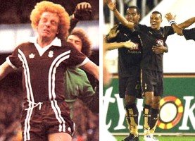
But then came that fateful day when the chairman, director and manager all sat round the table to choose a new design for the away kit. God only knows what must have been going through their minds. Perhaps they'd been out for an extra-long lunch at the pub or something. Who knows, but the result of their temporary lapse of reasoning was that Coventry City would for the next couple of years visit many of their opponents bedecked in brown, white and black. I think you'll agree, it was an absolute vision of loveliness. [IRONY.]


Ian Wallace (Coventry City, circa 1976) and Jermaine Jenas (Tottenham, 2006).

The odd thing is that just before the start of this season (2005/06), Tottenham resurrected the brown kit ploy thanks to their new manufacturers, Puma. With a splash of gold here or there, it looks rather more acceptable than the old Coventry strip ever did, but that colour's still rather alarming. Will we have to wait another 30 years before we see brown come back to the world of football kit design? Maybe not, if it's designed in the right way, but then that'll depend largely on whether Admiral are involved.

Friday, 16 June 2006

Obscure World Cup Kits From History #2

Nigeria (v Greece, 1994)

The early 90's was a time of great imagination in the world of football kit design. Improved technology and advances in the manufacturing process allowed the big name companies to produce ever more bizarre and outlandish strips.

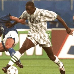
While some looked plain ridiculous, combining colours that simply didn't belong together, others focused on intricate and detailed patternwork. A prime example of the latter was never better illustrated than when Nigeria took to the field to play Greece in the 1994 World Cup.

The Greeks had first choice of kit colour, so naturally they went for their traditional blue shirts but that meant the Nigerians were unable to wear the green shirts they favoured, so out came their brand-new Adidas change strip of all white.

Yet this was no ordinary white strip. On closer inspection, those white shirts and shorts were actually riddled with what can only be described as an 'ethnic' pattern. While nothing like it had been seen before (and some would argue since), it seemed to work. Here was an African team wearing a kit that resonated African tribal symbolism... kind of.

OK, so some people compared it to your favourite old pair of pyjamas from when you were six years old, but I thought it was a bold and inventive design by those canny Germans, and it can't have done the Nigeria team any harm as they beat Greece by two goals to nil in what was in fact their first ever match at the World Cup.

What a way to make an entrance...