And so to the only four teams not signed up to the big three kit manufacturers (Adidas, Nike and Puma).
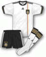
England's kit has never been supplied by any of those three (and we shudder to think what that might look like if it ever were). For the bulk of the last fifty-odd years it's been Umbro's privilege to do that and after numerous shirt designs they arrived at the 2010 vintage which was entirely white, save for the England badge and Umbro's red diamond logo.
Call it what you like – minimalist, plain, featureless, whatever – there's no getting away from the brilliant sense of simplicity it embodies. It's almost as if Umbro are saying only to things matter here – the national team's colour and the badge. If you think about it, that's quite an admirable stance to take as it brings everything back to the origins of kit design when fancy embellishments and weird colour-schemes were totally beyond comprehension.
There is, of course, the small matter of Umbro's 'tailored' styling which makes the shirt actually look like a shirt rather than a silky piece of fabric that's been rattled off a production line without any thought in southern Asia. It's got a proper collar, tapered sides and, well, it looks like it's just had a good ironing, frankly. 'Smart' barely does it justice…
But that's not all: the red away shirt was only recently launched and it too gives a generous nod in the direction of days gone by, notably the victorious era of the 1960's. With a round-necked shirt that was all red with only white cuffs to distract the view, the accompanying white shorts and red socks won’t have failed to bring back happy memories to all England fans of a certain age.
Ironically in this World Cup, we got to see this away kit in slightly modified form with the introduction of red shorts too. Very rarely have England worn an all-red change kit but when Fabio Capello's men strode out to play Slovenia a week ago or so, one wondered whether this wouldn't be the last we'd see of it. As it turned out, the Second Round match against Germany allowed for one more viewing, but we reckon it should be adopted permanently. It's bold, bright and a classic look for the England team to wear when the all-white isn't an option.
As for the other minor kit manufacturers, there's not a lot we can say really. Chile's kit is made by Brooks – probably better known for making sports shoes - and it too has been designed to be stylish in an understated way. Sadly we never got to see the change strip of white-red-blue, but at least the home strip looked smart without the garish use of formerly used devices like a huge Reebok logo.
North Korea seem to change kit manufacturer quite regularly, even switching to latest supplier Legea on the eve of the World Cup this summer. The Italian kit-maker promptly knocked off an uninspiring red outfit for the Dear Leader's boys and they duly repaid their gratitude by losing all three of their games, one of which saw them concede seven against Portugal. Perhaps a big Reebok logo might have done the trick…
Finally, there's Honduras and their kit was made by Joma, a Spanish company who are making inroads across many parts of the footballing world. Fans of Leicester City and Charlton will be all too familiar with the name, but whether they'll have been as satisfied as the Honduran fans with their kit remains to be seen.
The team from CONCACAF were seen all too briefly wearing an all-white strip featuring a shirt that had a blue band across the upper chest. The band faded from blue to white the nearer it got to the middle – a nice touch – and there were also some odd blue slashes either side of the bottom part of the shirt which, while serving no purpose, at least provided another point of interest. The away kit saw a reversal of the same, being all blue with white bits of business here and there. Quite nice, all in all.
And that's that. A very brief overview of the kits on show at this World Cup, and perhaps more importantly the sanity employed by each of the manufacturers when it came to designing them.
Once again, our great thanks go to John Devlin from True Colours Football Kits (www.truecoloursfootballkits.com) for the use of his excellent football kit graphics. To see all of John's World Cup kit designs in greater detail, click here.)
Showing posts with label kits. Show all posts
Sunday, 4 July 2010
Sunday, 20 June 2010
World Cup Kit Parade 2010: Puma
Without doubt the cornerstone of Puma's World Cup kit range for 2010 are those outfits created for its African teams. Of the six teams competing from that continent, Puma has supplied the kit for four of them (hosts South Africa and Nigeria being the exception) and they've already been seen my millions around the world having been launched just before the Cup of African Nations in January.
Where Algeria, Cameroon, Ghana and Ivory Coast are concerned, the home strips are smart, sleek, rather minimalist in their design and all the better off for it. Each of the shirts in question also have a unique feature of a panel on the right shoulder which have a shadowy logo – typically something associated with the relevant country. For Ghana it's the star which features on the country's flag, Ivory Coast have an elephant's head, Cameroon have a lion's head and Algeria have the head of a desert fox. A nice distinctive touch and one which Puma should be very pleased with.
Sadly the shoulder panel motif isn't carried through to the away shirts, but they've been given a theme of their own, namely 'stripes and hoops'. And what an impact they have. Algeria's green change shirt has a series of thin double-stripes in red and white which, when inspected at closer quarters, have a hand-painted look which is quite cleverly done. Cameroon's yellow away shirt takes a similar approach with single 'hand-painted' red lines.
When you get to Ghana's away shirt, however, things start to get a little crazy. In the past, Ghana have worn plain yellow to complement their white for home matches, but this year Puma have given them a shirt that’s red with thick yellow stripes, each one flanked with thin 'hand-painted' green lines. It is, to say the least, bold and ever so slightly garish.
Finally to the Ivory Coast and their away shirt looks more akin to a rugby outfit than anything else. It is predominantly green with thick white 'hand-painted' hoops, each of which is flanked with thin orange lines. The whole 'hand-painted' thing is very well executed indeed, although in all honesty it's very difficult to pick up on the work that's gone into the design if you're seeing the shirt from any more than 10 metres away. No matter – it shows someone's actually used a bit of originality at the drawing board stage.
It's not all about Africa though. Puma also have Italy, Switzerland and Uruguay on their books for this World Cup, and for each one they've taken a very modest design and added some flashes here and there in a contrasting colour to break things up a bit but not too much. Quite nice, but nothing as distinctive as was seen with the African countries mentioned previously.
Oh, but there was one other thing – the Italian home shirt has a huge shadow design on it which looks rather incongruous and, well, to be honest, we're not sure what it's supposed to be. Needless to say it's been likened to a robot's rib cage and that's probably good enough for us. It also forms part of an all-blue Italy strip which we don't often see but looks very imposing nonetheless.
Overall then, some particularly good work by Puma on those African kits while the others are just 'alright'. Nothing quite as wacky as Puma's former controversies like the sleeveless Cameroon shirt, but that's just as well. Us fans like originality, smartness and style in our kits, and that's pretty much what we've got here.
Coming soon: Part 4 - Umbro's kit's all-white, plus any other business
Our great thanks go to John Devlin from True Colours Football Kits (www.truecoloursfootballkits.com) for the use of his excellent football kit graphics. To see all of John's World Cup kit designs in greater detail, click here.)

Sadly the shoulder panel motif isn't carried through to the away shirts, but they've been given a theme of their own, namely 'stripes and hoops'. And what an impact they have. Algeria's green change shirt has a series of thin double-stripes in red and white which, when inspected at closer quarters, have a hand-painted look which is quite cleverly done. Cameroon's yellow away shirt takes a similar approach with single 'hand-painted' red lines.

Finally to the Ivory Coast and their away shirt looks more akin to a rugby outfit than anything else. It is predominantly green with thick white 'hand-painted' hoops, each of which is flanked with thin orange lines. The whole 'hand-painted' thing is very well executed indeed, although in all honesty it's very difficult to pick up on the work that's gone into the design if you're seeing the shirt from any more than 10 metres away. No matter – it shows someone's actually used a bit of originality at the drawing board stage.
It's not all about Africa though. Puma also have Italy, Switzerland and Uruguay on their books for this World Cup, and for each one they've taken a very modest design and added some flashes here and there in a contrasting colour to break things up a bit but not too much. Quite nice, but nothing as distinctive as was seen with the African countries mentioned previously.
Oh, but there was one other thing – the Italian home shirt has a huge shadow design on it which looks rather incongruous and, well, to be honest, we're not sure what it's supposed to be. Needless to say it's been likened to a robot's rib cage and that's probably good enough for us. It also forms part of an all-blue Italy strip which we don't often see but looks very imposing nonetheless.
Overall then, some particularly good work by Puma on those African kits while the others are just 'alright'. Nothing quite as wacky as Puma's former controversies like the sleeveless Cameroon shirt, but that's just as well. Us fans like originality, smartness and style in our kits, and that's pretty much what we've got here.
Coming soon: Part 4 - Umbro's kit's all-white, plus any other business
Our great thanks go to John Devlin from True Colours Football Kits (www.truecoloursfootballkits.com) for the use of his excellent football kit graphics. To see all of John's World Cup kit designs in greater detail, click here.)
Tuesday, 15 June 2010
World Cup Kit Parade 2010: Nike
I like to think of the office where the Nike World Cup kit designers work as being divided into three sections, each labelled ‘Sane’, ‘Slightly Silly’ and ‘Monster Raving Loony’. When you’ve seen the kits they’ve come up with for this summer’s tournament, it’s easy to spot which kit was designed by which part of the office.
At the neat and stylish end of their product range you’ll find the understated cool stitched into every fibre of the home shirts worn by Brazil, the Netherlands, New Zealand and the USA. A common theme on each is a single round-ended stripe in a contrasting colour running along the shoulders as it does down the sides of the shorts. A simple device which works a treat without being too showy.
If, however, you’re looking for something a little more daring, Nike won’t leave your desires unfulfilled. Both the Australia shirts (home and away) have a broad block of colour spanning the shoulders and sleeves, a thin second band of colour just below that and the rest of the shirt in the main third colour. Bold and uncomplicated, it hasn’t found favour with everybody – indeed one writer in The Guardian likened the home shirt to the sort of garb donned by an Aussie one-day cricketer.
Elsewhere, Nike’s Serbia home shirt has a white cross intersectioned over the right breast which scores points for originality, while Portugal’s home and away kit also set one foot beyond the boundaries of modest inoffensiveness.
The home strip is no longer all red for the first time in many a year and the shirt features a broad green band across the upper chest. The away shirt is all white and has a racy green and red double-stripe running down the centre from top to bottom.
But if that’s not extravagant enough for you, why not try the new Slovenia home and away shirts? Both look resplendent (if that’s the word I’m looking for) with a zig-zagging stripe spanning at mid-chest level. The white home shirt has a green zig-zag and the green away shirt has a white zig-zag. One can only guess whether the designer was an amateur mountaineer or perhaps a doctor that works with heart-rate charts. Strange...
All things considered then, Nike have provided something for everyone – normal kits, abnormal kits and something in-between, all of them well made and all likely to prove popular with fans around the world.
Coming soon: Part 3 - Puma and their off-the-shoulder numbers...
Our great thanks go to John Devlin from True Colours Football Kits (www.truecoloursfootballkits.com) for the use of his excellent football kit graphics. To see all of John's World Cup kit designs in greater detail, click here.)
Friday, 11 June 2010
World Cup Kit Parade 2010: Adidas
In the first of a four-part series, Some People Are On The Pitch assesses the wide range of football kits you’ll be seeing during the 2010 World Cup, looking at the output of each manufacturer in sequence.
Adidas
With twelve World Cup countries in its portfolio, Adidas is once again assured of maximum visibility when the competition gets underway tomorrow.
As is not uncommon, the German company has ensured a modest degree of individuality to creep into the designs for its top teams while others have had to settle for an off-the-shelf template outfit. France’s blue home shirt, for example, features red and white flashes in a nod to some of its former designs including those for Euro ’84 and World Cup ’98.
Germany’s white shirt for home games has an understated yet smart trio of pinstripes in the colours of the national flag running from top to bottom, dissecting the club crest as it does so. A nice touch and a world away from the bold, some would say ‘garish’ shirt of World Cup ’94.
Japan’s home and away shirts both feature a short red block appearing from the underside of the collar – something you won’t find on any other country’s shirt, but given its slightly mystifying nature, perhaps that won’t be regarded as any kind of tragedy.
Denmark, on the other hand, have a curious white band going across the chest of their shirt, made up of eleven rows of dotted lines forming an illusion of visual perspective. The lines are supposed to be a tribute to the efforts of the eleven men making up the Danish team – a distinctive design and one which does Adidas great credit.
Sadly not every team wearing Adidas at this year’s World Cup are quite so lucky. The home shirts for many teams such as Greece, Slovakia, Spain and Nigeria (as well as the away versions for others including Denmark, Argentina and Paraguay) look like the kind of thing your ambitious Sunday League team would be happy to wear given half a chance. Sitting somewhere in the middle of the Adidas World Cup range, however, are the hybrids – those shirts which look like they were taken one step on from the base-level design but no further than that.
For examples of this, see the home shirts for South Africa and Mexico, replete as they are with two strange under-arm blobs. We’re sure they would’ve been something more distinct, but perhaps the designer took an early lunch and never came back. Oh well, you can’t win ‘em all...
Taken as a whole then, Adidas have produced a smart range of shirts and kits which are understated in their style, but style there most definitely is. You won’t find anything wacky or beyond the realms of good taste – moreover, you’ll get style in abundance even if, at times, there occasionally seems to be a lack of imagination.
Coming soon: Part 2 - Nike go for the sublime and the ridiculous...
Our great thanks go to John Devlin from True Colours Football Kits (www.truecoloursfootballkits.com) for the use of his excellent football kit graphics. To see all of John's World Cup kit designs in greater detail, click here.)
Subscribe to:
Posts (Atom)