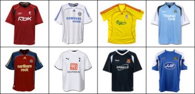
The good news, however, is that I have another eight new shirts for you to see (some albeit in slightly blurry form, for which I humbly apologise). Cast your eyes over this little lot...

On the top row from left to right we have the new away shirts for Bolton Wanderers, Chelsea and Liverpool along with the new Manchester City home shirt. On the bottom row we have the new Newcastle United away shirt, the new home shirt for Tottenham Hotspur, the new away shirt for West Ham United and Wigan Athletic's new home shirt.
Out of this bunch, I think I'm most impressed with the new Manchester City home shirt. They haven't had a decent blue one for ages but I think Reebok have finally hit the bullseye there.
Tottenham have a bold new simple design for their kit thanks to Puma who were the most prevalent manufacturer at this summer's World Cup. Their shirt is now completely devoid of any stripes or patterns... on the front! If you're after some embellishments, look for the navy blue panel across the back on the shoulders...
Finally it's good to see (from my point of view) Liverpool go back to a yellow away kit and Adidas have come up trumps with the offering shown above. It'll no doubt please those Reds fans who'll be hoping for a return to the form shown by their club in the early 1980's when a kit similar to this one was worn.
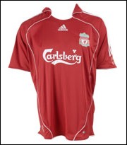
On the subject of Liverpool, another apology. I was lead to believe by an unnamed website that the new Liverpool home shirt would look like the one we showed in part 1. As it turned out, the final product looked completely different, so here to correct the matter is a picture of what the shirt really does look like...


Quoting Chris "Well despite my best Google-bashing efforts, I failed to get a decent picture of the new Watford home kit for the 2006/07 season, so I gave up on that altogether."
ReplyDeleteI took a look as well and you're right. Even the Watford FC official web site has totally crap pics on it.
Now there's a topic you could explore. A review of the official club web sites. Must be a few laughs to be gained there.
I too was looking forward to the yellow Liverpool away kit, but felt somewhat disappointed when I saw it.
ReplyDeleteShame really
Great idea, Kedge! I shall certainly be looking into the weird and wonderful world of official club sites at some stage in the near future!
ReplyDeleteAs for the Liverpool away kit, I saw it at the weekend, and I still like it! :)